

My UX Process Pt.2 - D-E-S-I-G-N
How does UX Design look like in practice? Here's how I work with my clients.

Previously I talked about how we try to understand the problem and figuring out what we want to work on. Next comes design.
Ideations and High Fidelity Designs
Having done the research, we know have an idea of what we want built. It's time to lay the groundwork for the project. This is where I create wireframes and low level designs of the product. Wireframes are great for situations where you might not need a fully designed project. They are faster to create, more adaptable, and cost effective for the client. Maybe the developer already has a UI framework (Bootstrap, Tailwind, Semantic, Material, etc.) and can create the rest of the UI if I just provide detailed wireframes, including notes on why I use certain components.
At the ideation stage, we can explore a lot of options on what directions the UX and UI will go. I can create interactive prototypes in Figma that can be tested with users and stakeholders and can be used to gather feedback. That is much more cost effective and time saving than coding the product, and making large changes in code. Your developers will appreciate it.
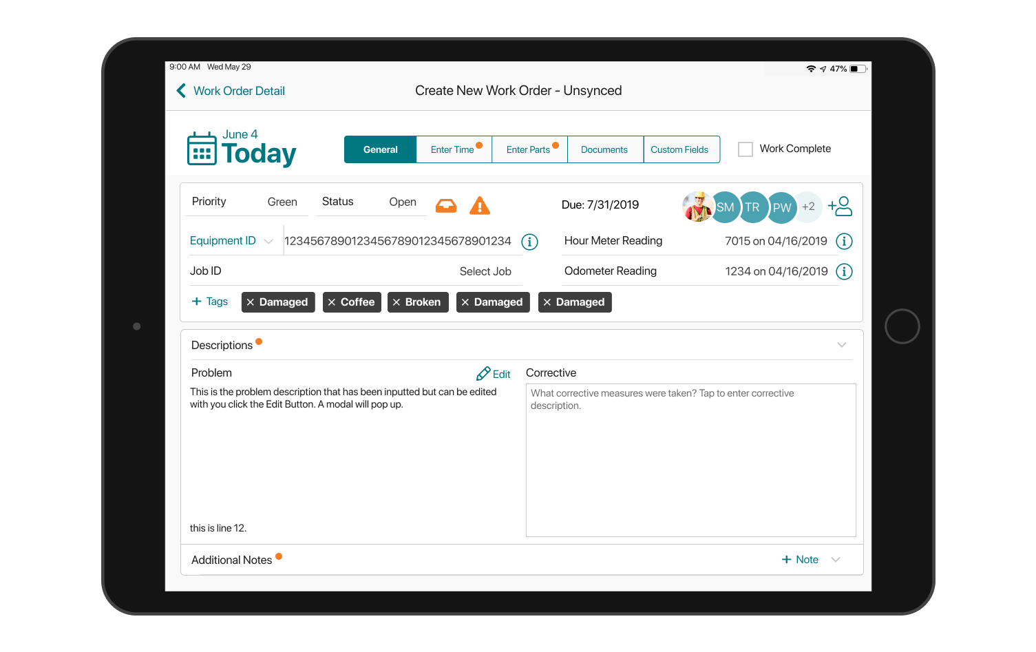
Above is an example of what my wireframes looked like in my last project. This is called a redlining, and is generally present during developer hand-off. These design specification are given to the developer once the design of the product has been finalized and is ready for development. Think of these as blueprints, but not as rigid. I will be available for consult during development, so those numbers can always change.
Is redlining necessary for all projects? Of course not. The brilliance of delivering the client a Figma prototype is to have a clickable version of your product in your hands. The developer can get all the information they need because they have access

Building the product
Of course, there are situations where we don't need to go through the full UI design process, just wireframes might be enough. We can use our data from our scope and research phase and start implementing right away.
As I mentioned before, developers might be completely fine with coding the UI with just my wireframes. If it’s a website project, we can start building using Squarespace, Wordpress, Wix, etc. For a more powerful website with more customizability, Webflow is definitely the tool to use. It’s quite robust and gives me more freedom to directly translate my designs in Figma to a full-fledged websites.

During development of the product, whether it is with a developer or me doing it myself, the situation may change. What we thought was possible during design might not be the case during development. The scope of the problem can change, or we might even run into some minor issues that will require us to go back and fix those. We will have to be able to adapt to new information presented to us. The final product will reflect the hard work.
Testing and Iterations
Whether we have designed the prototype, or developed the full website, we won't know if it is successful unless we test it with our users. This is crucial. You test it with users where they are comfortable and observe them. You ask them questions and get feedback. Then you go back and make those changes to your designs before handing it off to development.
Here’s the mistake I made back while I was building my startup, Shoot. I was still a rookie developer and not that knowledgeable about design. I basically made this in code, showed it to my cofounders and decided to ship it. This was still the website beta so any feedback and changes we could gather would be after shipping.
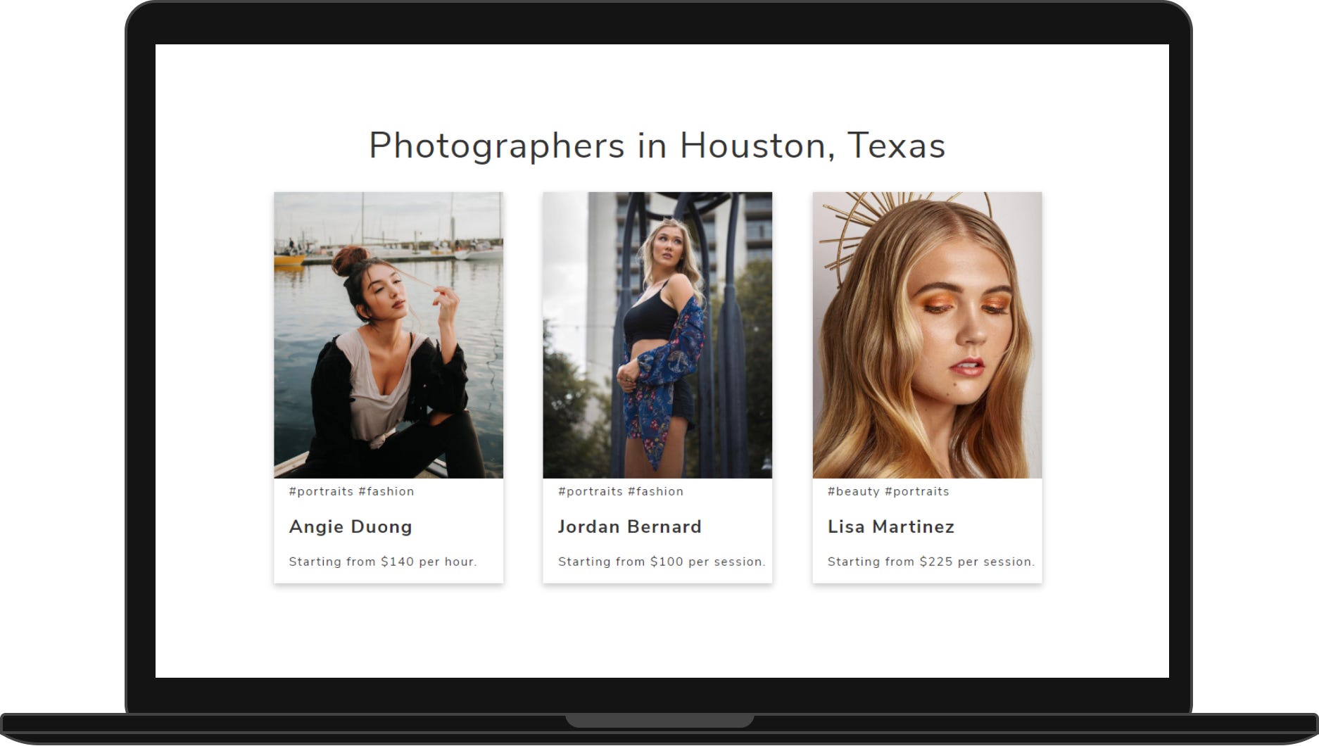
We went to our university campus and asked random college students to check out our website. We didn’t tell them what it was for or what we wanted to do, we wanted them to figure it out. We wanted them to click on the cards, which would take them to the photographer’s full profile. But they never clicked. And why would they? There were no indications that you are supposed to click the cards.

We redesigned the cards. We added a button, we added the photographer’s photo, we made the cards look more modern. We added a subtitle to indicate that customers can book the photographers. When we tested it out again, customers right away understood what Shoot was. My mistake was designing it directly in code instead of making a simple prototype on Figma.
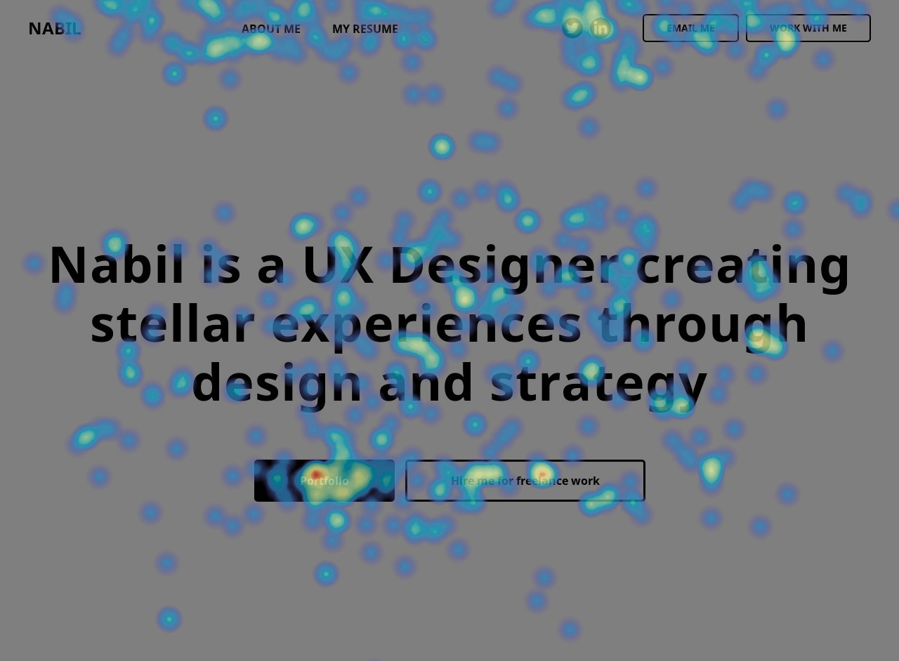
Another way you can see how people interact with your app or website is using powerful analytical tools like Hotjar that give you qualitative data such as heatmaps and user recordings. You can actually SEE your user’s browsing patterns, how long they stay on the website, what they click or don’t click on, and you can use that to further improve your designs.
Conclusion
So many companies make the mistake of not testing their products. They only realize it when customers start complaining, or when they start giving 1 star review on the app store. Then, the company spends more money and more time fixing these issues that have piled up on their desk. Complaints aren’t avoidable but it can be reduced by a lot if the proper research is undertaken and the product is tested at the design phase before it makes its way to development.
I am currently open for full time, contract, and freelance work. Check out my website at https://www.mdnabilahsan.com/